
More learners open a course on their phone than on a laptop now. If your course was built for a big screen first, it probably feels clunky on a small one. That is what mobile-first course design fixes. You build for the phone first, then let the bigger screen version follow.
This post is a checklist, not a theory lesson. Use it to check your current course, or to build a new one the right way from day one. Grab a phone, open your current course, and go through each item below one at a time. Most of these fixes take an afternoon, not a full rebuild.
Why This Matters More Than Ever
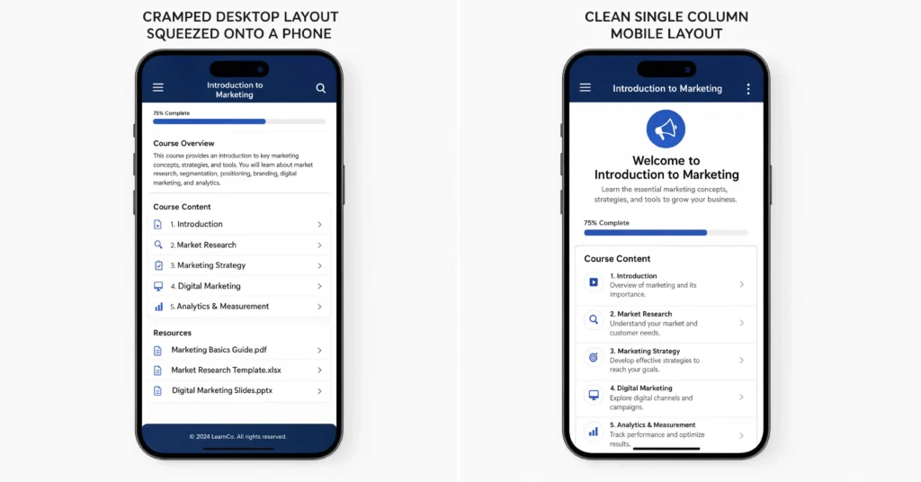
A course built for a laptop and just squeezed onto a phone usually breaks in small ways. Text gets too small. Buttons sit too close together. Videos take forever to load on a weak signal. None of these problems show up on a demo laptop, but they show up fast in the real world.
This is not a small edge case anymore. Frontline workers, field staff, and busy managers are often mobile only during their work day. If a course design assumes everyone has a laptop open and a quiet desk, it quietly locks out a big share of the people it was meant to reach.
Good mobile learning design is not about making things smaller. It is about rethinking what someone actually needs when they are holding a phone, maybe standing on a train, with one hand free. Designing courses for mobile devices means starting from that picture, not from a laptop screen, and working outward. Once you plan for that, a lot of your other design choices get easier and clearer.
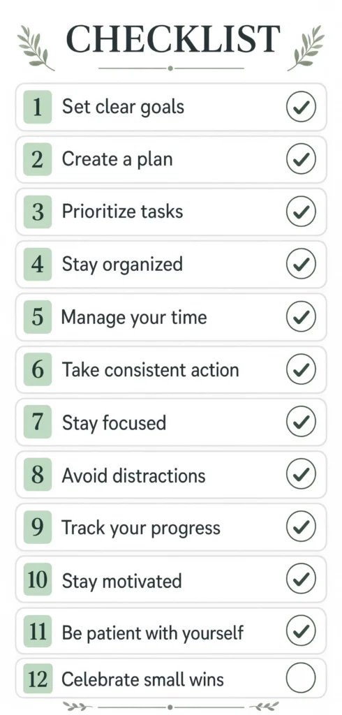
The Mobile Learning Checklist
1. Set a Minimum Text Size
Anything under 16 pixels is hard to read on a small screen without zooming in. Set a comfortable base size and stick to it across every lesson, not just the homepage. Headings should stand out clearly from body text too, since a learner scanning quickly on a small screen relies on that contrast to find their place again after they get interrupted.
2. Use One Column, Not Three
Multi column layouts that look fine on a desktop often break apart on a phone. Stack content in a single column so someone can read straight down without pinching or scrolling sideways.
3. Make Every Button Big Enough to Tap
Small buttons placed close together cause mistaps and frustration. Nielsen Norman Group’s research on touch targets recommends keeping tappable buttons at least about one centimeter wide, with clear space around each one so a thumb does not hit the wrong choice. A quiz with four answer choices packed close together is a common offender. Give each choice its own tappable row with room to breathe, instead of squeezing four small buttons into one line.
4. Caption Every Video by Default
Most people watch on the go with the sound off. If your video only makes sense with audio, a huge chunk of your learners are missing the point entirely. Turn captions on as the default setting, not something someone has to dig for in a menu.
5. Keep Lessons Short
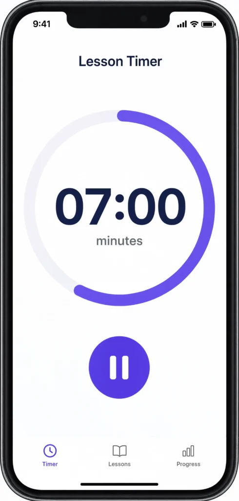
Long lessons are harder to sit through on a phone than on a desktop, since a phone invites more interruptions. A text message, a notification, or someone talking nearby can break focus at any moment. Aim for lessons that fit inside five to ten minutes so someone can finish one during a short break, and design each lesson so it still makes sense if someone has to pause halfway through and come back later. Our post on microlearning strategies for busy teams goes deeper on how to break a longer course into short, standalone lessons like this.
6. Test on a Slow Connection, Not Just Wifi
A course that loads fine on office wifi can crawl on a train or in a parking lot. Test your course on a slower connection on purpose, and compress images and video so pages load fast even when the signal is weak.
7. Build for One Thumb
Most people hold a phone in one hand and tap with their thumb. Put important buttons near the bottom third of the screen, where a thumb naturally reaches, instead of tucked in a far corner.
8. Avoid Sideways Scrolling
If someone has to scroll sideways to read a sentence or see a chart, something in your layout is too wide for the screen. Everything, including tables and images, should resize to fit the screen width.
9. Make Forms Short and Simple
Long forms are painful to fill out on a phone keyboard. Ask for only what you truly need, and use the right keyboard type for each field, like a number pad for a phone number. If a form has more than five or six fields, break it into two shorter steps instead of one long one, so it feels quicker even if the total number of fields stays the same.
10. Check Offline Access
Not every learner has a steady connection all day. Where possible, let a lesson be downloaded ahead of time so someone can keep learning on a plane, in a basement, or anywhere signal drops.
11. Save Progress Automatically
Do not rely on someone tapping a save button before they get interrupted. Save progress in the background after every small step, like finishing a page or answering a question, so a dropped connection or a closed app never costs someone their place in the lesson.
12. Match Images to Screen Size
A large desktop sized image slows down a phone for no reason. Serve a smaller version of each image to phone screens automatically, so pages load fast without learners noticing any drop in quality.
For teams building this out fully, our guide to the future of e-learning covers how this fits with other big shifts, like AI tools and shorter lessons.
Responsive Course Design vs a Separate Mobile Version
Some teams try to build two versions of a course, one for desktop and one just for phones. This usually creates more work and more bugs, since every update now needs to happen twice.
Responsive course design solves this a different way. You build one course, and the layout automatically adjusts to fit whatever screen it is opened on. Google’s own guidance on mobile-first indexing recommends this same approach for websites in general, since it is easier to maintain and gives every device the same content without extra work.
A good mobile learning strategy usually leans on this same idea. Instead of maintaining two separate course experiences, you maintain one flexible one, and test it across a few device sizes to catch anything that breaks.
A simple way to test this without much extra work is to pick three device sizes. Test on a small phone screen, a large phone screen, and a tablet. If a lesson works cleanly on all three without any sideways scrolling or squashed buttons, it will almost always work fine on the sizes in between as well.
Common Mistakes in Mobile-First eLearning
The most common mistake is designing on a large monitor and only checking the phone version at the very end. By then, awkward spacing and tiny buttons are baked into every lesson, and fixing it means redoing a lot of work.
Another mistake is assuming a responsive eLearning design tool will fix everything automatically. These tools help, but they cannot fix content that was written with long paragraphs and wide tables in mind. You still have to write and structure content with a small screen in mind from the start.
A third mistake is skipping real device testing. A course can look fine in a browser’s phone preview mode and still feel wrong on an actual phone, where things like keyboard pop ups and notification bars change how much space you actually have.
Our post on measuring learner engagement and completion data covers how to spot these problems after launch, by watching where mobile learners specifically drop off compared to desktop learners.
A fourth mistake worth naming is ignoring notifications and interruptions in your design. Desktop learners usually sit through a lesson start to finish in one go. Mobile learners get pulled away constantly. A lesson that loses someone’s progress the moment they switch apps or lock their screen will frustrate far more people than a slightly longer load time ever will.
Frequently Asked Questions
Q: What is the difference between mobile-first and mobile-friendly?
A: Mobile-friendly usually means a desktop course that still works on a phone. Mobile-first means you design for the phone screen first, then adapt up to bigger screens, which tends to produce a cleaner result.
Q: Do I need separate mobile-friendly online courses for phones and tablets?
A: Not usually. A single responsive layout that adjusts to screen size covers phones, tablets, and desktops without needing separate versions to maintain.
Q: What are the eLearning course design best practices for mobile specifically?
A: Big enough tap targets, short lessons, captions by default, one column layouts, and testing on a real device instead of just a browser preview are the biggest wins.
Q: How do I know if my course actually works well on mobile?
A: Check completion rates and drop off points for mobile users specifically, not just overall numbers. A big gap between mobile and desktop completion is a clear sign something in the design needs fixing.
Q: Does mobile-first design cost more to build?
A: It can cost a bit more upfront, since you are testing across more screen sizes early on. It usually costs less over time, since you are maintaining one flexible course instead of two separate versions.
Final Thoughts
Mobile-first course design is not about shrinking a desktop course down. It means starting with the phone screen, the thumb, and the short attention window someone has on the go, then building outward from there. Run through the checklist above on your current course. Fix the two or three items that clearly do not pass, then test again on a real phone before you call it done. Small fixes, like bigger buttons or shorter lessons, often make a bigger difference than a full redesign, so start with whatever is easiest to change first.